SaaS · Creator economy · Case study
Vonza: Redesigning an all-in-one platform for course creators and coaches
Vonza gives creators one place to sell courses, run communities and manage members. We redesigned the core product experience and integrated the pieces so users could get more done in fewer clicks.
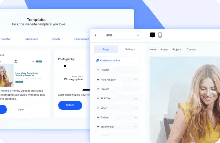
- Client
- Vonza
- Team
- 3 engineers, 1 UX/UI designer, 1 project manager
- Timeline
- 16 weeks for the redesign and integration, followed by ongoing support
- Services
- UI/UX design, Web development, Enterprise software
Where they started.
- A broad feature set had grown faster than the interface, so common tasks took too many steps.
- Inconsistent UI patterns across modules made the platform feel like several products rather than one.
- New capabilities needed to plug into the existing stack without disrupting paying customers.
The approach.
- Audited the main user journeys and redesigned them around the tasks creators perform most.
- Built a shared component library so every module looks and behaves the same way.
- Integrated new features through the existing APIs with staged rollouts to avoid downtime.
- Reviewed every screen for detail: empty states, loading states, error handling and responsive behaviour.
What shipped.
- UX audit and redesigned user journeys
- Design system and reusable component library
- Responsive front-end implementation
- Technical integration of new modules with the existing platform
- QA pass across browsers and devices
How the engagement ran.
Context
Vonza serves course creators and coaches who run their whole business, from selling courses to managing communities and members, inside one product. The platform had grown feature by feature, and the interface had not kept pace: common tasks took too many steps and modules looked and behaved differently from one another. The brief was to redesign the core experience and integrate new capabilities without disrupting paying customers.
How we worked
The team was three engineers, a UX/UI designer and a project manager, working in two-week sprints with a demo at the end of each. Design ran one sprint ahead of engineering in Figma, and a shared component library was built first so every module inherited the same patterns. Work was managed in the client's own tracker with daily written updates and a weekly call. New features were integrated through the existing APIs and released behind flags to staged groups of users, and the engagement moved into ongoing support after launch with the same engineers.
What changed.
- Improved user engagement following the UX/UI redesign, according to the client.
- A consistent, polished experience across modules that the client described as flawless.
- New features integrated without disruption to existing customers.
- An ongoing relationship built on the client's confidence in our commitment to their vision.